Visualization
Source: The Economist
Critique
Information Resolution
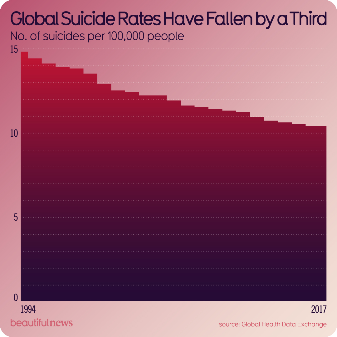
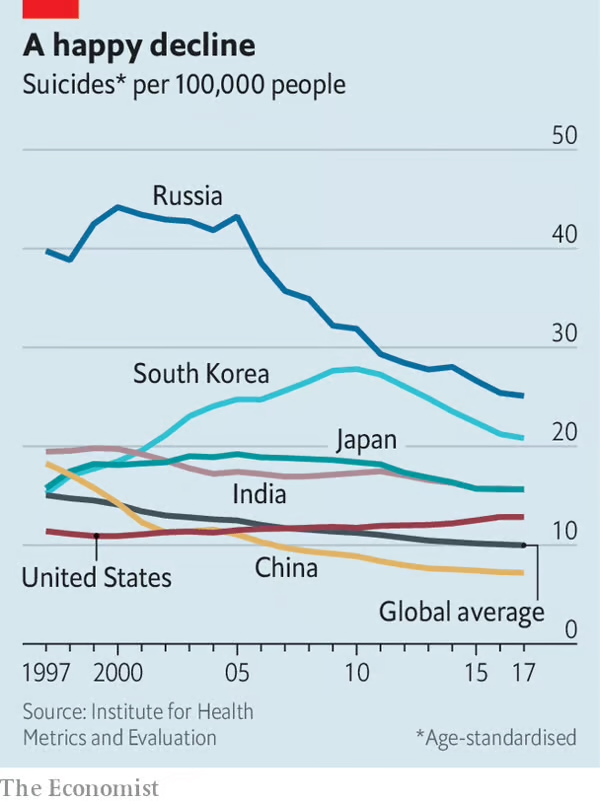
After reading the article attached to the infographic I found on Beautiful News, I feel the graph is misleading. Although the global average has gone down from ~15 per 100,000 people to ~10 per 100,000, it simply is the average. When looking at the data, however, we can see that only 3 of the countries' suicide rates have fallen - Russia, India, and China. The United States and South Korea's rates, conversely, have risen; South Korea's by about 5 people, too. Japan, though a line graph is never accurate by simply reading it, saw a rise in suicide before returning to its starting level. When broken down country-by-country, we can see just how misleading the simple “global suicide rates have fallen by a third” can be.
Effects Without Causes
The article explains how each country listed on The Economist's graph has combated its suicide rate or how it has “naturally” fallen. It primarily focuses on Russia, which had the greatest fall in suicide rates. The trend has been greatly impacted by the decrease in alcoholism and the recovery from the fall of the Soviet Union. The article also explains how norms have changed across various societies, particularly in India and China, and how these changes have improved women's quality of life. It then goes on to explain different government regulations regarding products, chemicals, and drugs that were prominent causes of suicidal deaths. Lastly, the article covers how relationships and parasocial relationships can lead to, or prevent, suicides and how they have affected the rates over the years. All three of these notes are important to understand how to continue the bettering of the standard of living and keep the suicide rates in a decline.
Looking at the graph alone, I would not have known the driving factors into the “global fall” in suicide rates, moreless the inaccuracy of just grouping all of this data into an average.
Cherry-Picking
I keep putting “global” in quotation marks because it seems wrong to classify 6 countries as global. I understand that the study chose heavily populated countries, but the study also completely avoided several continents - South America, Africa, Europe, and Australia. I feel the study should have added at least 3 heavily populated countries per continent to use the word “global.” Even with the countries chosen, the narrative of the article is primarily driven by Russia's data. If Russia's data was removed, the entire premise of the article would be invalid. If I could guess, if the study brought in other countries and removed Russia's data, the line of data would maybe decrease by 1 or 2 people per 100,000 based on the trends seen by the other countries studied.
Conclusion
Overall, I feel this infographic is misleading and cuts out much of the important information from the article. Though my evaluation has been mostly negative, I do feel this study is important and shows a lot of growth and progress for the care for mankind. We have grown as a species and are headed towards better livelihoods worldwide, and I feel the infograph does an injustice to the efforts made. It overlooks the commitment by these popular countries to care for their people. I appreciate the positive outlook made by the creator, but I wish they had thought about the information shared deeper and the ramifications that could arise from the lack of transparency.